2025
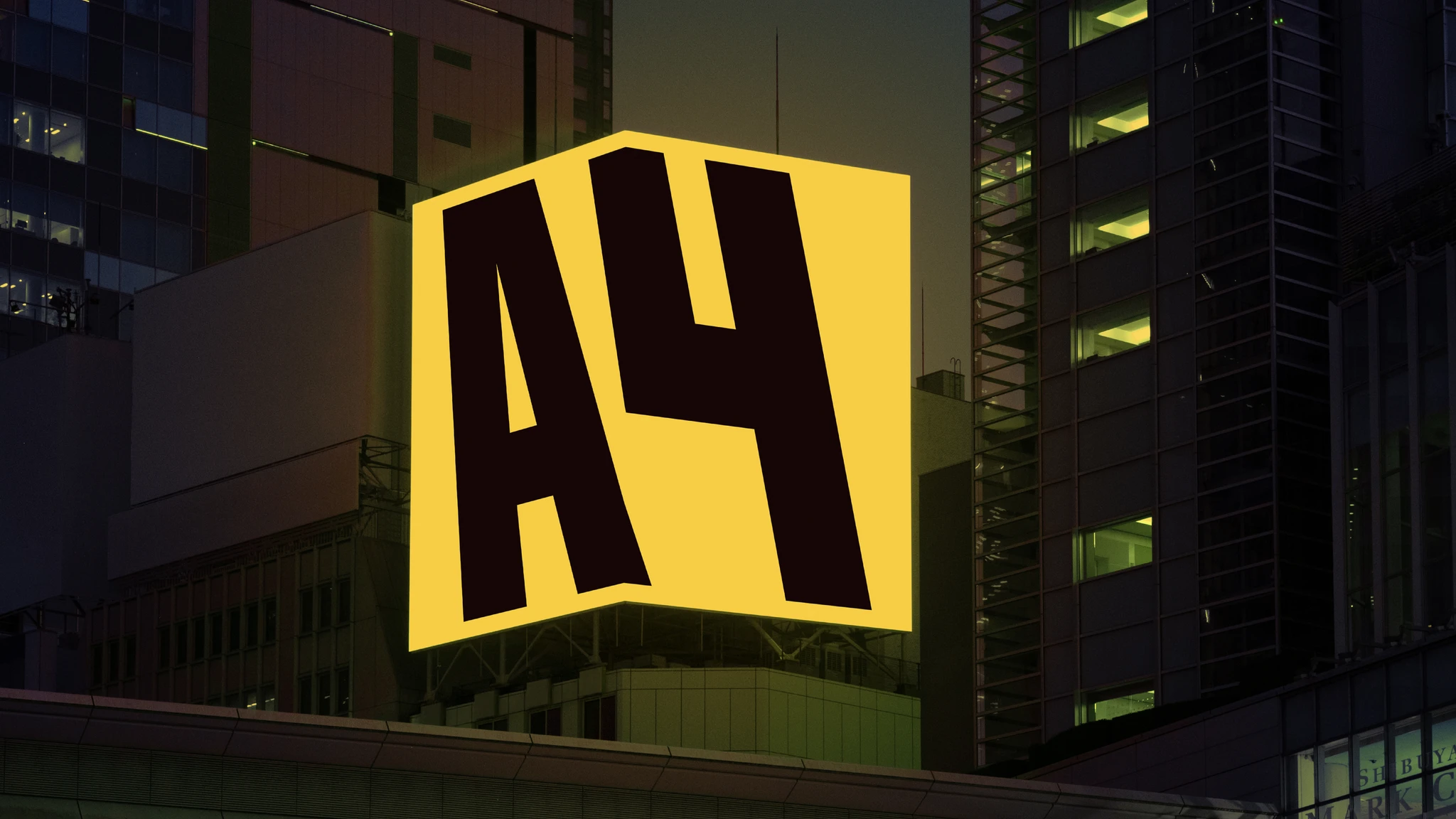
The old visual style of «A4» no longer matched the real scale of the brand and looked morally outdated. The previous logo with thin lines and cold colors looked insecure, poorly stood out on store shelves and did not evoke a sense of quality. The graphics were too “dry” and faceless, and the brand character was simply lost in the corner of the packaging.
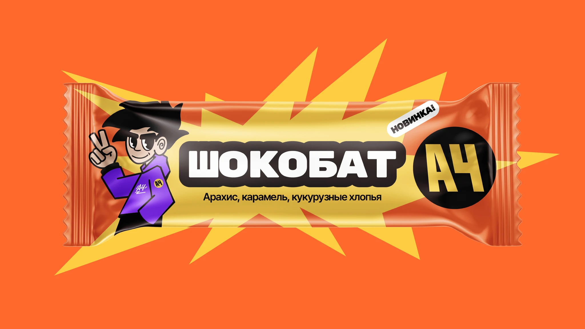
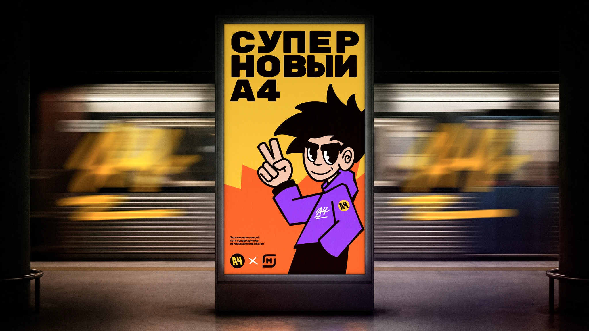
We carried out a large-scale redesign, turning «A4» into a strong and confident FMCG brand. New monolithic and extremely simple logo in a contrasting circular plaque, juicy warm color palette, updated lively character and dynamic graphic motif that appeals to both children and adults. Result — modern “adult” packaging that builds trust and instantly catches the eye.